Would you know if a great logo was staring you in the face?
Would you know if the logo design you have just chosen is the right choice?
......How can you tell?
A good logo is all about the balance between being attractive and being functional.
- Too much emphasis on the aesthetics can make your logo too overwhelming which means you won’t engage the customer in a positive way.
- Focusing on the functionality too heavily can result in a boring, lifeless, unmemorable logo.
Your logo is the visual aspect that sets you apart from your competition.
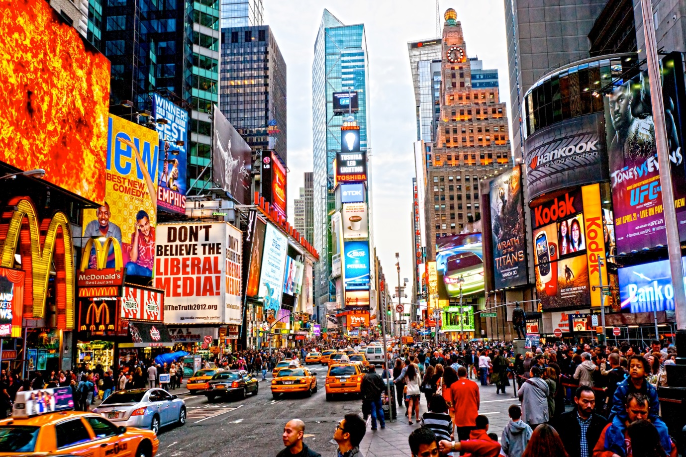
In a constant sea of advertising, you want your logo to be the one that sticks out in the crowd and makes customers pick up your brochure above anyone else’s.
Your logo needs to be timeless.
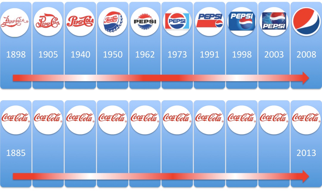
When you establish a business, you have the intention to be running that business until you retire and then passing it on to your children to uphold your legacy. Over the years you want to establish that brand association within your customers and having a consistent, timeless logo makes you memorable. When we compare Coco Cola to Pepsi you can see how often Pepsi has changed their look over the last 100+ years, whereas Coca Cola has remained the same since 1885 - and their difference in success is clear, along with their ability to be recognised world wide by that iconic font and the colour red.
It needs to be simple.
When you’re driving along at 110km hour and happen to glance at a sign on the side of the road you’ve only got a couple of seconds to register what that sign says. A simple logo that gets the message across straight away is going to be much more effective. Alternatively, a busy logo with lots of fine detail isn’t going to reproduce well when it is printed at the size of a postage stamp. When we look at some of the more predominant logos in society we notice that they are simple and bold, and every man and his dog knows what they stand for.
Every element is essential to creating a good design.
Make meaningful colour choices – for example, the colour green is a great representation for the environment, being outside and healthy, so it suits logos such as Greenpeace, John Deere, Subway, Jeep. However, it wouldn’t be suitable for every market – I can’t imagine that Barbie would have been quite as successful with Green instead of her famous Pink branding.
Choose appropriate fonts – there are millions of fonts out there now and many more get made every single day. Font selection can be one of the most important choices when it comes to your logo. You want something that is easy to read but also reflects your business aims and personality. For example, a car company would not want a messy hand written font when they are trying to sell cars that are sleek, slimline and classy.
Avoid distracting elements such as Ltd, Pty, EST 1901 - AND avoid tag lines– these are all things that you can incorporate elsewhere into your marketing. You don’t want these as part of your main logo as they draw attention away from the main point of interest.
When designing a logo and I reach the point where I am reasonably happy with a design, I run through this checklist before sending the design to a client:
- Does is suit the purpose of the business?
- Does it suit the target audience?
- Can you describe the logo to someone easily?
- Can it be printed in 1 colour?
- Can it be printed really small and really large?
- Can it be printed inverse?
- Can it be embroidered?
A logo is just a shop front for your business – don’t try and say too much - that is what your advertising material is for.
The purpose of your logo is to grab the customer’s attention and reel them in.


