Last week we were very excited to make the new Unity College website live. When Unity College came to us for a fresh new design they had a strong clear brief. They had done their research. And as we started the design process we realised a lot of what they were after really epitomised the big website design trends of 2015/16. As you read our guide below make sure you visit www.unitycollege.sa.edu.au to spot the trends in action.
10 current website design trends
1. Longer scrolling sites
With the use of smart phones and tablets skyrocketing more and more people now view websites through these devices rather than on a computer. This has created the trend for websites to be designed as longer scrolling sites, rather than linking to other pages as a way find content.
This is quite simply because on these mobile devices scrolling is much easier than clicking. This seems to be especially common on the home page, but can also be found on other pages. Unity College website has a long scrolling home page.
2. Large statement images
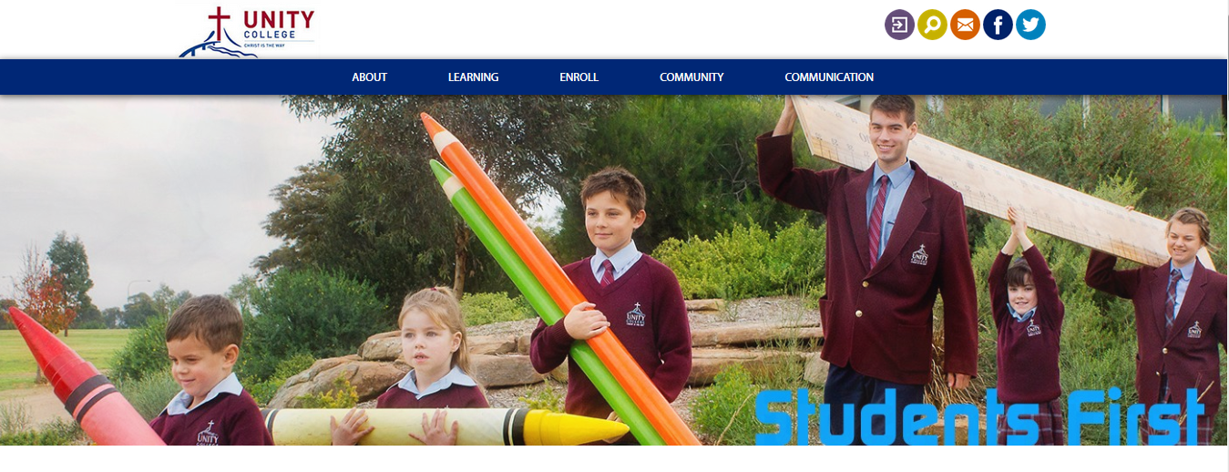
This trend goes hand in hand with the longer scrolling sites. Large statement images at the top of the page are very popular and this trend seems to be sticking around. It wasn’t that long ago a major concern was to have all your important key messages on your website visible before you had to scroll down. However, now it has become more common to have a visually pleasing image that takes up a large percentage (if not all) of the screen. This often has text overlaid with one simple key message – for Unity College this is ‘Students First’.
3. Flat design
What is ‘flat design’? This is a style of design WITHOUT any stylistic elements that give the illusion of being 3 dimensional – for example the use of drop shadows, gradients or textures. This often gives the appearance of a minimal design and is also very compatible with making sure your website looks fantastic as a responsive design. These icons are a great example of flat design in action on Unity College:
![]()
4. Responsive design
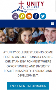
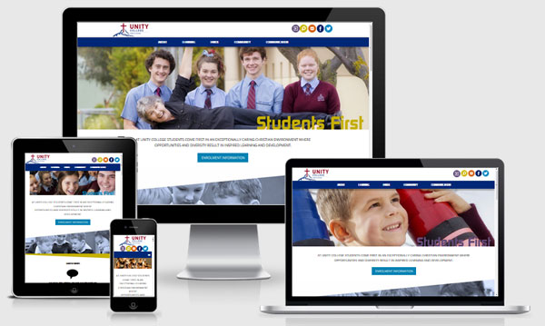
‘Responsive design’ is definitely the latest buzz word in website development – it really is a must. Make sure your website is responsive – so that it can easily be viewed and navigated on all devices – phones, tablets and computers – read more here ‘Make Your Website Mobile Responsive’. Below is how Unity College’s website layout changes when viewed on a mobile phone.

5. Sticky Menu
A sticky menu is a menu that is locked to the top of the screen – so as you scroll down a long screen it doesn’t disappear. Research has shown that this makes a website faster to navigate because you don’t have to scroll back to the top to click through to a different page that you want to view. Unity College chose to make their sticky menu slightly transparent.

6. Prominent social media icons
Social media is an easy way to help get your website content shared so if you are using it in your business then make sure your website has prominent links to your social media pages. We recommend including them in your websites header design.

7. Smooth scroll links
Make navigating your website a pleasure with the addition of smooth scroll links. On our Unity College website’s home page have a look for the icon shown below and click on it to try it out.

Another recent trend is to have floating ‘scroll to the top’ arrows at the bottom of longer pages.
7. Interactive images
Create some interest with interactive images – you will notice as you scroll over the images shown below on Unity College’s home page that the image changes its opacity level to become clearer. This creates some interest and professionalism for the design. In the image below the curser is over the blue image making it completely clear.

8. Include statement text or a quote
Another prominent website design trend is to include statement text or a quote. The text used for this is usually very short (just one sentence) and is normally positioned across the full width of your website. These factors combined with a fairly large font ensure it draws the visitor’s eye and is a great way to include a key message or a short testimonial.
Below is an example of statement text on Unity College’s website – in this case we have placed the text against a white background in contrast to the rest of their home page that is quite bright. But it is also common to see these statement text areas have a solid block of colour behind them.

9. Simpler second page design
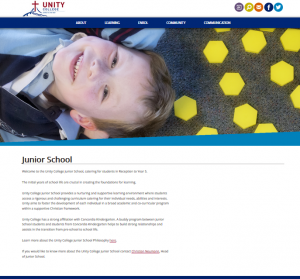
Our final website trend is for websites to have a second page design (or layout). A lot of websites are now built with a busy (often quite full on) home page design that includes a lot of images and interactive elements. But then a second design is used for all the other pages in the menu. These pages often hold more of the “meat” of the website and so it is good to keep the design for these pages more minimal (while still reflecting the overall look and feel of the home page) as it allows the visitor to read the details displayed without distraction. On Unity College’s website you can compare these two page designs:

Plainer second page design
We hope you found some great ideas within this article. Remember, when considering the design of your website make sure you do your research. Your website designer should help you and offer suggestions but it is also a great help for you to have examples of websites that you like and those that you don’t like. It is also smart to check out what your competitors are doing on their websites.
This is by no means a comprehensive list of 2015/16 website design trends – there are lots and lots of current trends and they are always evolving. If you have spotted the emergence of other web design trends this year we would love for you to let us know in the comments below.


