
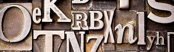
Since the invention of the computer, people have been developing new fonts to make the information we generate look more interesting and stand out from the crowd.
We now live in an age where there are millions, if not billions of fonts at our disposal. So how on earth are we meant to choose just one!??
From a designer’s point of view, I have count down the 8 most hated fonts you should AVOID and why they would do you an injustice if used them on your next report, business card, flyer, website etc.
8th:
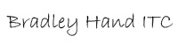
Over used! Bradley Hand ITC is the most commonly used ‘handwriting’ imitation font. It is pointless to use on any form of heading or piece of text that you want to stand out as it is too thin, even if emphasized. It is also an annoying font when it comes to large blocks of text as the readability decreases as the size gets smaller.
7th:
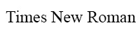
As the default font for Microsoft Word for years, Times New Roman became boring and corny. It was over-used and has resulted in it being substantially unpopular.
Designers find it unappealing due to it’s narrow-spacing because it was originally designed for newspapers. Its Bold version is also increasingly difficult to read.
6th:

Brush Script is the most generic font used for awards and certificates. It is like calligraphy without all the effort. It is over used and effectively a ‘tacky’ attempt at trying to be classy with their design.
5th:

Curlz is a font that should never have even been invented! Unless you are under the age of 7 and are a girl, or advertising baby products, you should not be using this font! I think it is fairly self-explanatory.
4th:

This is a designer’s arch nemesis. Helvetica is EVERYWHERE! It is boring, it is stiff and it is just so common – how do you intend to stand out or create interest with this font??!
3rd:

Courier is one of the most boring unimaginative fonts you can use. There is a reason we moved away from the typewriter and to the computer, so why would we want to revert back to the only font that typewriters could use! We are beyond that era.
2nd:

We’re not living in Ancient Egypt anymore, so why do we need to write using ancient Egyptian style font? Papyrus is a highly over-used font and the saturation of it has caused people to strongly detest it these days. It is also difficult to read in a large block.
And finally… I present to you the most HATED font world-wide!
1st:
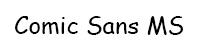
Comic Sans was originally designed for Comic Book developers to use in the little speech bubbles. It was then adopted by school age children due to its ‘fun’ appearance. – This is where it should have stopped! Comic Sans is a very unprofessional font, it lacks formality and appears childish, so should not be used for anything that is intended to be serious. This is the only font that has a dedicated website against it! http://www.comicsanscriminal.com/
Special mentions must also go to:


 (Wingdings)

Every designer that you talk to will have varying opinions about the fonts that they like / don’t like. It does generally come down to personal preference. But the main things that you need to take into consideration when choosing a font to use are:
- Legibility – how easy is it to read that font? You want to be able to get your information across quickly and clearly, and a font with too much going on is going to require more concentration from the reader.
- Versatility – is the font versatile enough to be blown up really big for a billboard, but also still easily readable if it were shrunk down to go on a letterhead or a business card? Versatility can also come in the form of whether it has the option to be bold, semi-bold, condensed, italics etc. – Not all fonts – particularly more custom ones that you would download, come with what we call a ‘Font Face Kit’ which gives you all of these variations of the same font. So be aware that you may have to mix and match fonts together if you find this really cool font for the title on your poster, but it doesn’t have a font face kit.
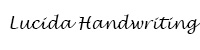
- Ability to Adapt to Change – when developing advertising, logos or websites etc, we design these with the intention that they are going to be around and relevant for a long period of time. Design trends change from year to year, and what might be the ‘in thing’ one year, could completely disappear in 12 months time. So it is important to factor that in when choosing a font – select something that is timeless and can adapt to the changing trends. For example, a lot of cursive or calligraphy style fonts are now associated with quite old fashioned design, depending on how they are used. They also suffer from readability issues when used in web design. So my advice is to steer clear of using them as much as possible.
For me personally, these are some free fonts that I like using and feel they are legible, versatile and timeless:
1.

It is the new default font in Microsoft Word, however I believe Myriad Pro is an incredibly versatile and professional font. The trick with Myriad Pro is knowing how to use it to make it look interesting. Simply by changing the line spacing (tracking), letter spacing (kerning) or using the condensed version can provide you with so much variety and interest. And when used in a logo with it doesn’t compete with the imagery, instead it balances the design.
2.

League Gothic is my substitute for Impact – it is a bolder, stronger font (just not as intense as Impact) that you’d use on posters and in logo design. It also comes with the versatility to use expanded, condensed and italics. And it is nice and legible.
3.

Bebas Neue is probably one of my favourites at the moment. I have been using this quite a bit in print advertising and logo designs. It is bold and striking without being too overwhelming. It is quite similar to League Gothic, but I just like the extra width to the letters that Bebas has.
4.
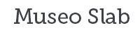
Museo Slab is quite common at the moment, you quite often see it being used for inspirational or quirky quotes – usually white writing on a black background. I haven’t used this a lot myself, but it is a very versatile font kit as you can use all of the variations together and it generates a lot of interest, but keeps it consistent at the same time.
5.

Open Sans is my go to font when it comes to web design. It is clean, professional, easy to read on all devices and it just looks really smart accompanying any design.
My list could go on and on – but that would just be overwhelming and confusing, so best to keep it simple. Everyone is going to have their favourites and everyone’s taste is different – but as long as we keep in mind Legibility, Versatility, and Ability to Adapt to Change, we can all find the most suitable fonts for our design.