Website trends and the technology we use to build those websites are constantly changing. What we have the ability to do now is very different to what was possible ten years (or even five years) ago. Here are six examples of businesses who have recently redeveloped their website and have taken advantages of these changes.
Banquet Angus
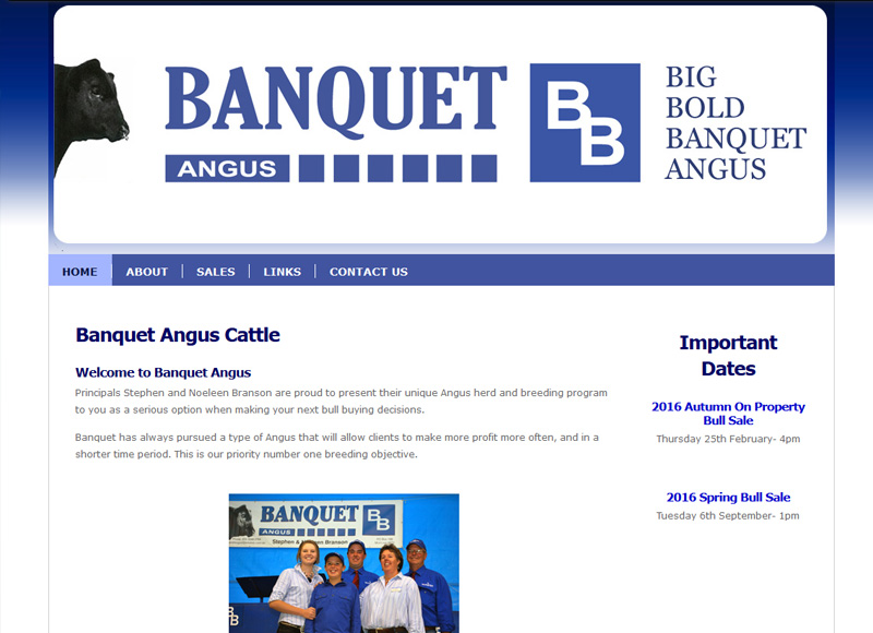
(click and drag the slider to view old vs new)
Changes to the website includes:
- Mobile responsive
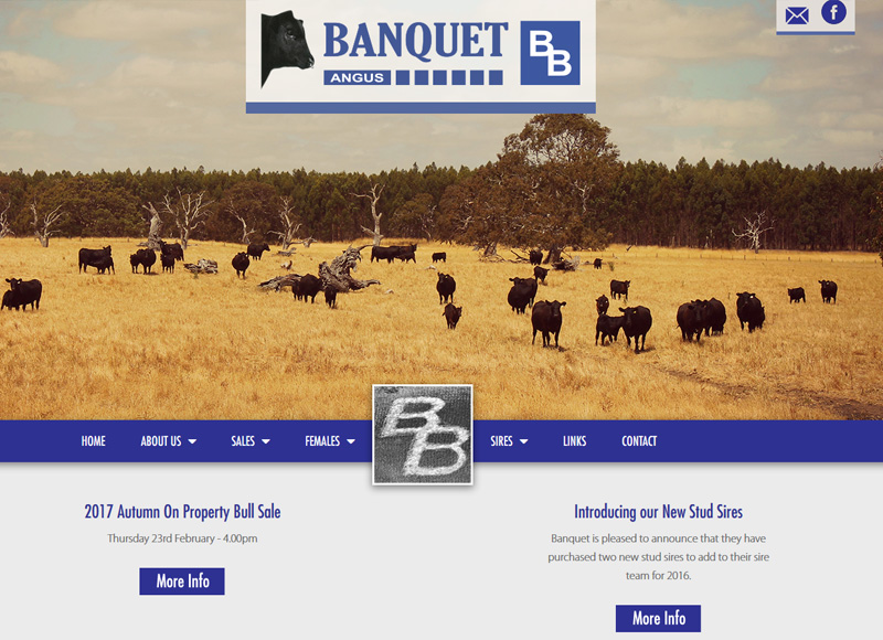
- Full-width page content with large photo slider on home page
- Static banner images for other pages
- Video and photo galleries
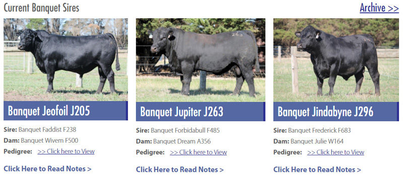
- 3 column grid to showcase Sires & Females
When redesigning the Banquet Angus website, we made it mobile responsive. This means that it will respond to the size of the screen that a person is viewing the website on (laptop, smartphone, tablet and more). Given that more and more people are choosing access the internet from their mobile devices, it is becoming more important to have a website that can cope with this change – both for aesthetics and for search engine optimisation.
Banquet Angus’ new website adopted fresh, modern design with the use of full-width content (meaning the content and images on the page filled the entire width of the browser) and a large statement image on the homepage. Video and photo galleries were also added to showcase sale information. The videos were first uploaded to YouTube, which provides another way for new visitors could find their website.
(click and drag the slider to view old vs new)
Changes to the website include:
- Long scrolling home page with highlight areas for most important content
- Mobile responsive
- Sticky Menu
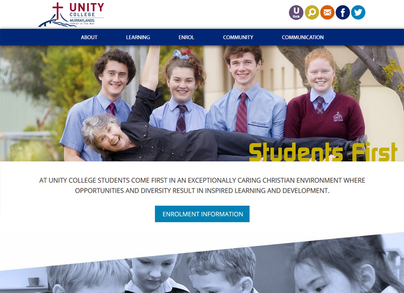
- Modern, full width design
- Icons for easy links to social media
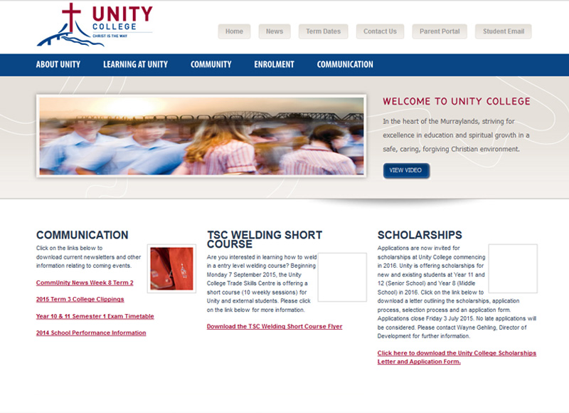
When redeveloping the Unity College website, we added new features that were not possible when their previous website was first designed. This includes the use of a smooth scroll link and a sticky menu.
Smooth scroll links allows the viewer to easily navigate a long page.  When the link is clicked, it scrolls the visitor smoothly to the next section.
A sticky menu is a menu that is locked to the top of the screen. When a visitor scrolls down a long page, the menu follows, rather than disappearing. This makes the website faster to navigate as you don’t have to scroll back up to the top to get to the next page.
![]()
The website design was also given a much more modern feel with the use of ‘flat design’. This refers to design without any stylistic elements that give the illusion of it being three dimensional (for example, no drop shadows, gradients or textures are used).

Mobile Responsive Design
Another website trend that Unity College incorporated in their website was the use of a longer, scrolling homepage. This trend developed in response to the increased use of mobile phones and tablets to view websites. Scrolling down one page on your smartphone is much faster than clicking through to the next page.
>> View Unity College Website
Detpa Grove
(click and drag the slider to view old vs new)
Changes to the website include:
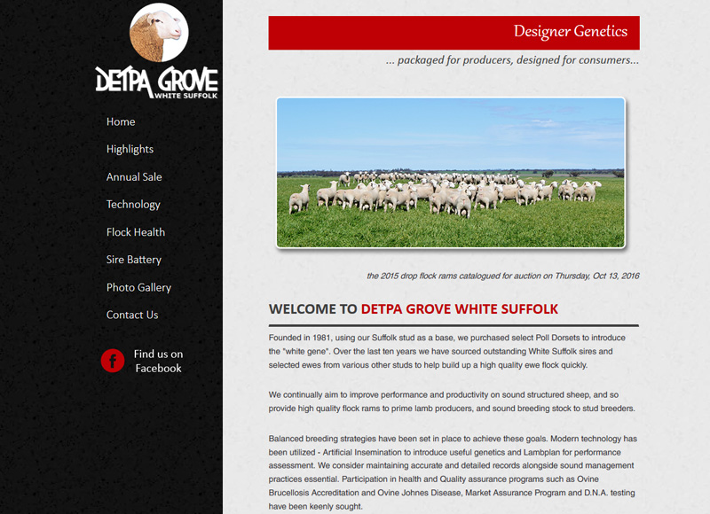
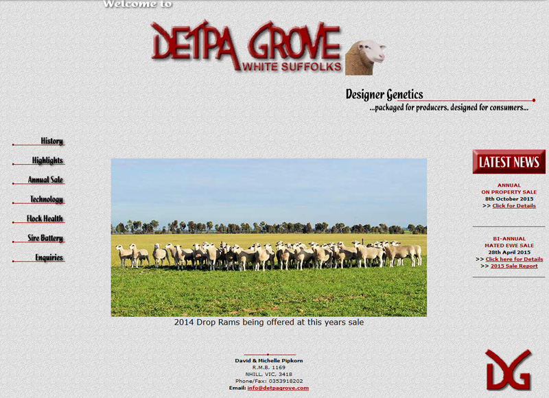
- Fresh modern design but kept the recognisable Detpa Grove branding and colours
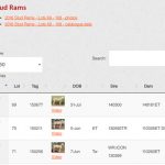
- Sortable tables for online sale catalogues with linkable data to videos, photos and more info
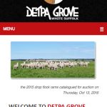
- Mobile responsive
- Content Management System so the client can now update it.
The redevelopments made to the Detpa Grove website made it easier for our client to better showcase the rams and ewes in his upcoming sale. Sortable and filterable tables were used to display the ASBVs and photo of each sheep. The new tables also allowed a video of each stud ram to be added. While it was possible to embed this information on the previous website, the ability to import the information (rather than adding manually) saved hours of time.
The redevelopment also meant that Detpa Grove moved from a HTML website to a new CMS platform. The practical advantage of a CMS website is that the client can choose to add or remove pages, text and photographs to their website without our help (opposed to HTML websites, where any changes need to be made by a web developer).
(click and drag the slider to view old vs new)

Mobile Responsive Design
Changes to the website includes:
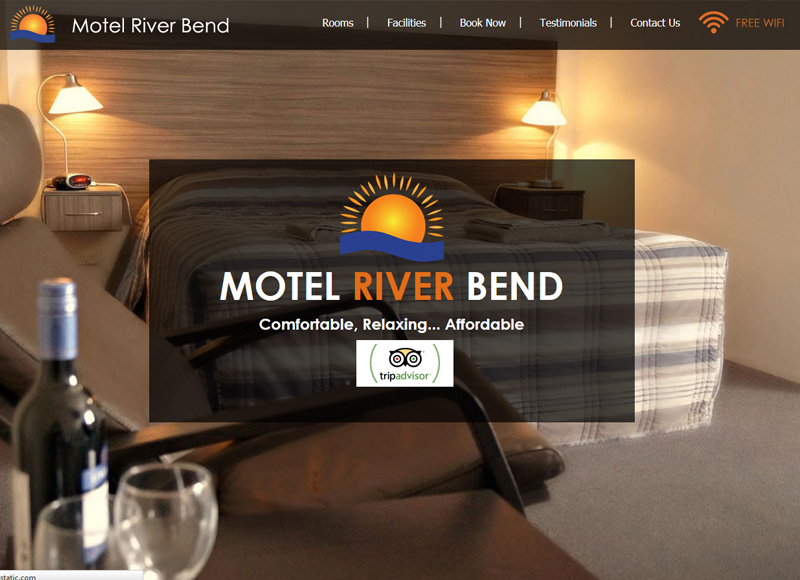
- Beautiful new full-width design showcasing their renovated rooms
- Emphasis on photos to tell the story
- A long scrolling pages
- Mobile responsive
- 'Click to Phone' function which makes it easy for visitors to call when viewing the website from their mobile device.
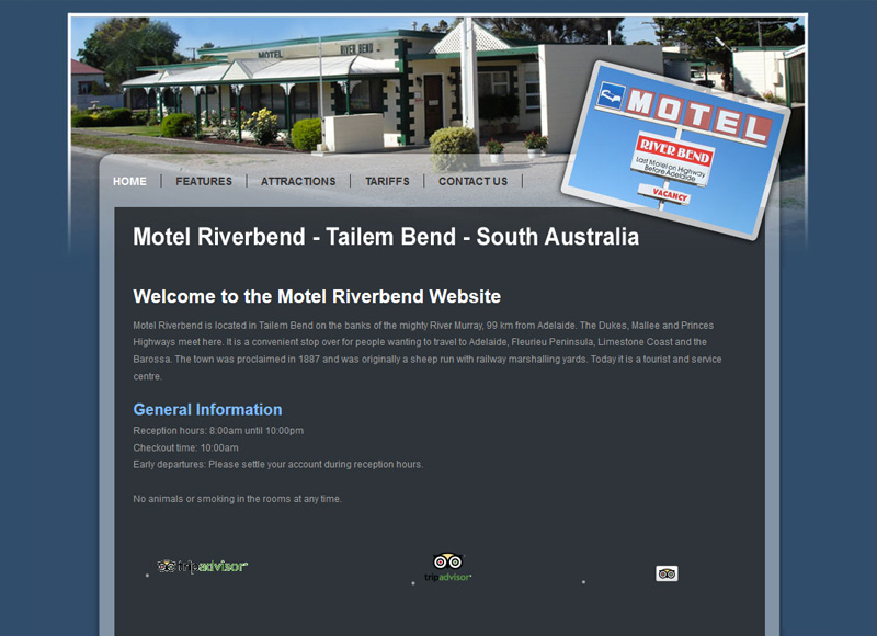
Motel Riverbend chose to update their website to give it a new, fresh design. In doing so, we were also able to add further features, like the “Click to Call" phone number. This means, when a visitor views the website on their mobile phone, they have an option of just clicking on the phone number to make the phone call rather than leaving the page and dialling the number.
A trend that Motel Riverbend incorporated into their new design was the use of full width images that filled the width of the screen or browser. Rather than listing all the reviews down the page, they chose to display them as a rollover testimonial. One review is displayed before it scrolls left off the screen and is replaced by the second.
>> View Motel Riverbend Website
Australian Dorper and White Dorper Association Inc
(click and drag the slider to view old vs new)
Changes to the website includes:
- Redesigned page template
- Wider screen design
- Mobile responsive
- Facebook Feed embedded on the page
- Colour/Mono transitioning for rollover images
- Rollover sponsor adverts
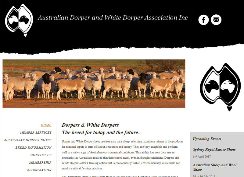
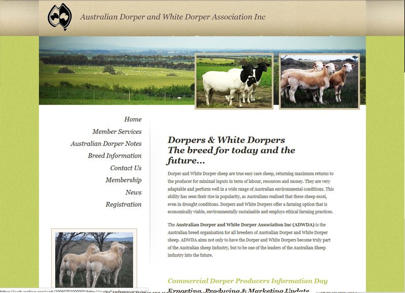
The ADWDA is a perfect example of how the redesign of a website doesn’t have to be drastic. In this case, they chose not to do a full redevelopment, but rather just redesign the template of their website. This redesign included widening the entire site to make it more in line with industry standards and give it a more modern feel. We also added rollover images, a Facebook feed and a new rollover sponsor advert area.
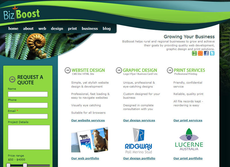
Bizboost
(click and drag the slider to view old vs new)

Mobile Responsive Design
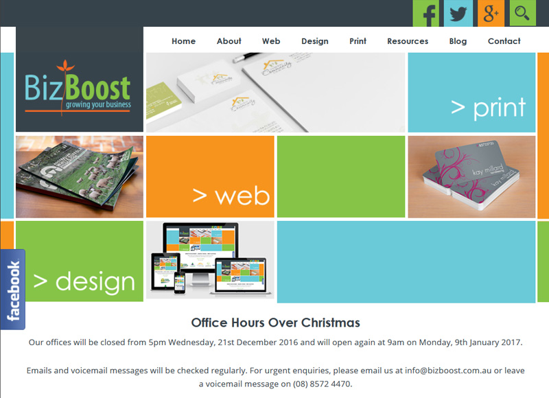
Last year we decided to also give our own website a facelift. One thing incorporated into the design was the use of ‘element transitions’. This is where the buttons and text fade in when you scroll down to them.
We also integrated the new website with our social media and content marketing. A new blog was added along with a live Facebook Feed that slides out on the side of a page. We also added two opt in forms to our website. The first (on our homepage) encourages visitors to sign up to receive our 5 Secrets to Boost Your Business. The second (in the footer below) gives visitors the option of subscribing to our monthly eNewsletter.
Other changes:
- Mobile Responsive
- Use of flat design
- A sticky menu
- Full-width content


