So, you’ve put time and effort into crafting the perfect website for your business. The next challenge is to get traffic to your masterpiece.
If you’ve spent any time looking at Search Engine Optimisation (optimising your site so that it ranks highly in search engine results), you’ll know that getting to the top of the list in Google is as much of an art form as it is science. This is complicated further by the fact that Google is constantly changing the algorithms that dictate where you fall on that list. A website that ranked well a few years ago, might now be too out of date to keep up.
The bad news? Google has recently announced an update in the way that they gather information from websites. The good news? Everything you need to know about Mobile-First Indexing is below.
What Is Mobile-First Indexing
Google has recently announced that, after a year and a half of testing, they will be migrating some websites over to Mobile-First Indexing.
To explain how this change works, I need to first explain how indexing works. When a person searches for a word or term in the search engine, Google needs to decide what website will be of most use to the searcher. They do this by first crawling the internet and ‘indexing’ what they find. They will look at a variety of information including the text on a page (what keywords are used), how fresh the website is, the website’s security and much more. This information is what Google uses to ‘rank’ each website, starting with what they believe will be most helpful to the searcher.
Traditionally, Google has always crawled the desktop version of a website’s page (in other words, they’ll look at how the page appears on a desktop computer, not how it appears when viewing on a mobile). However, in some cases, the desktop version can be vastly different from the mobile version of the site.
After this recent update, any site that has been migrated to Mobile-First Indexing will be assessed on the mobile version of their website, not the desktop version. This reflects current behaviour trends and the fact that 70% of searches in 2017 originated from a mobile device.

What Does This Mean for Your Website?
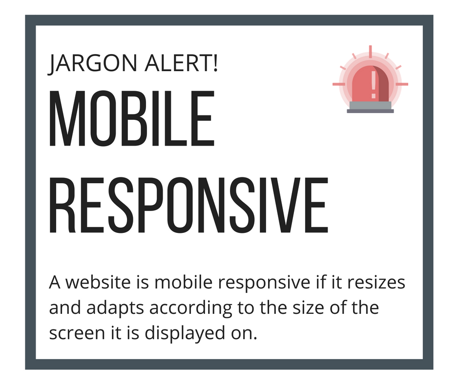
If your site is not yet mobile responsive, it doesn’t mean that you will be excluded from the search results entirely. Google has assured us that the change relates to how they gather content, not on how that content will then be ranked. If a website doesn’t have a mobile version, then the desktop version will be used instead. Content gathered by mobile-first ranking will not have an advantage over desktop ranking.
However, there is also no denying that having a mobile-ready site will give you a large advantage in the search results, thanks to other algorithms that Google run concurrently with mobile-first indexing. If your site is not yet mobile responsive, it could result in you ranking lower in the search results then other similar websites. As Google have said themselves:
… we continue to encourage webmasters to make their content mobile-friendly. We do evaluate all content in our index -- whether it is desktop or mobile -- to determine how mobile-friendly it is.

Google’s goal here is to increase the user experience for the person using their search engine. Viewing a non-mobile responsive website on your mobile phone is difficult – you need to scroll and zoom to be able to read the text or navigate the page. For this reason, Google will prioritise a mobile responsive website in their search results, especially where the browser is using their mobile phone or other device.
These continued changes reflect Google’s overall view that having a mobile responsive website is essential if you are serious about being found in the search results. While it’s already hard for a non-responsive site to compete, there will come a time where they won’t be ranked at all.
How Do I Know if My Site Is Mobile Responsive?
If your website has been built by us in the past five years, you can rest assured that it’s mobile responsive. However, if it’s an older site built before mobile responsive coding was introduced, or built by a different developer, it’s worth checking.
To find out if your website is mobile responsive, visit www.responsivedesignchecker.com/
The good news is that, if your website is not yet mobile responsive, this can be easily fixed (often without the need for an entirely new website. For more information or to get a quote contact us on (08) 8572 4470 or at info@bizboost.com.au.


