How an Outdated Design Principle Can Benefit Your Business
Keeping an important message "Above the Fold" used to be the golden rule when it came to web design.
The concept came from the early days of print publishing when newspapers were folded in half and then stacked on the newsstand. Only the top half of the first article was visible and therefore was the most likely to be read by people passing by. The goal, of course, was to make this content as engaging and gripping as possible to entice more people to stop and read more.
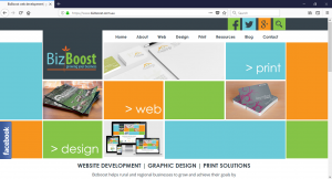
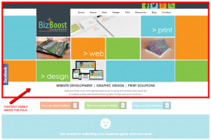
In the early days of the dot-com boom, this idea carried on to website development. However, instead of it being a fold in a newspaper, "above the fold" refers to the content at the top of each page that was visible without the need to scroll down further.
The viewer needs to scroll to see what is below.
Today, keeping content above the fold is not nearly as important as it used to be. Internet connection speeds are faster, and we are just generally more likely to scroll down the page further (social media has us well trained). As such, the rule is not as hard-fast as it used to be. As long as you have your logo/business name and menu, you're good to go.
Not to mention, what classifies as "above the fold" can change drastically depending on what device you're viewing the website on. Are you using a laptop computer? A tablet? A mobile phone? Is that mobile an iPhone 8 Plus or a Samsung Galaxy S6? A page will be displayed differently on each of these devices.
Despite these challenges, there are some occasions where putting certain information at the top of the page will help increase readership and engagement on your website. We live in a world where the average attention span has decreased severely compared to 10 years ago. Website visitors rarely take the time to read a full website page, top to bottom. Instead, they might skim read the first paragraph and then the headings on the page. From this, they will make an assessment as to whether they need to read more or move elsewhere.
At the end of the day, it is the top section of your page (in other words, the space above the fold) that is going to attract the most eyeballs. It makes sense that you want to make this space as engaging and useful to your audience as possible.
Here are a few examples of how you can use this principle to our benefit:
An Important Message
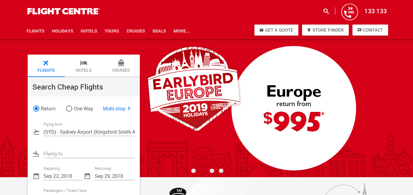
Does the page in question contain a really important message that you want your website visitor to see? This might be your unique selling point, a feature you offer that your competition doesn’t, the latest product you’ve launched or the fact that you have an upcoming sale.
In this case, the last thing you want to do is bury that point within the text further down the page. Instead, feature it at the top of the page where visitors will see it, even when skim reading.
Example:
A Call to Action
Do you want a visitor to take a certain action when they visit a certain page on your website? Perhaps you want them to sign up for your limited time offer. Maybe you want them to contact you for more details about a service you offer (or for a quote). If so, feature this first on the page.
Example:
Downright Beautiful Photography
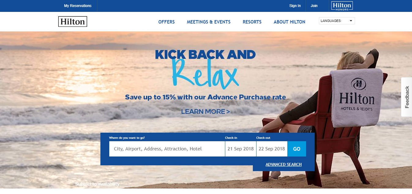
They say an image speaks 1000 words. Take advantage of this by including a featured image at the top of a page (relevant to the text below, of course). This might be a professional shot of your product or a photo of your office. Either way, you want it to be eye-catching.
Examples:
So, while the above the fold concept might be outdated, it is still useful to think about. The key here is to be intentional about how you structure the information on each page of your site. What is the purpose of that page? What information is most important or useful to your audience? Catering to your visitors in this way can make all the difference in how effective your website will be.


