Business Boosting Tip #2
How to Effectively Establish your Branding
With so many businesses out there competing for attention, people tend to make their initial assumptions based on face value. Whilst we often hear the phrase ‘don’t judge someone by their appearance’, when it comes to spending our money, we are instinctively attracted to businesses and shopfronts that are aesthetically pleasing to the eye. Once we establish that relationship with a business and find ourselves pleased with their goods or services, we tend to associate their brand as one we like and will return to or recommend to others. As a business owner, your utmost goal is to generate that positive relationship with your customers. Once you have that, you want them to remember you and that comes about by effective branding. That is when your logo becomes your identity.
Whether you choose to hire a top notch designer or prefer the DIY method, there are many things that you need to think about when establishing your brand.

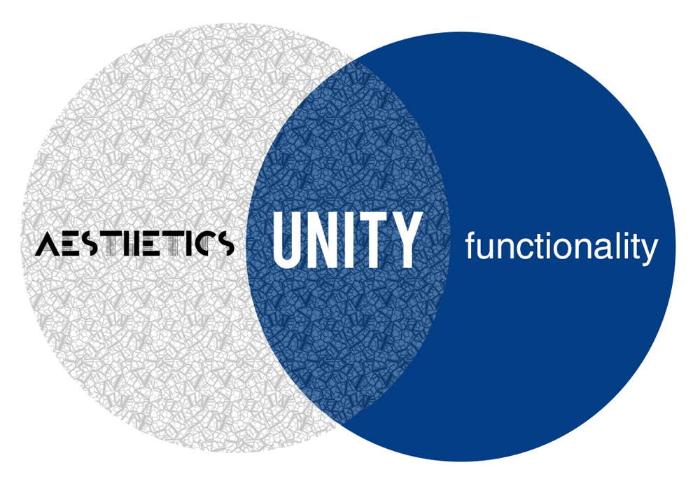
A good logo is all about the balance between being attractive and being functional.
Too much emphasis on the aesthetics can make your logo too overwhelming which means you won’t engage the customer in a positive way.
Focusing on the functionality too heavily can result in a boring, lifeless, unmemorable logo.

Your logo is the visual aspect that sets you apart from your competition.
In a constant sea of advertising, you want your logo to be the one that sticks out in the crowd and makes customers pick up your brochure above anyone else.

Your logo needs to be timeless.
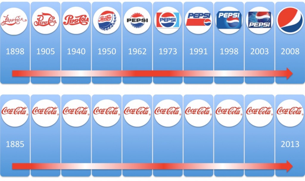
When you establish a business, you have the intention to be running that business until you retire and then passing it on to your children to uphold your legacy. Over the years you want to establish that brand association within your customers and having a consistent, timeless logo makes you memorable. When we compare Coco Cola to Pepsi you can see how often Pepsi has changed their look over the last 100+ years, whereas Coca Cola has remained the same since 1885 – and their difference in success is clear, along with their ability to be recognised worldwide by that iconic font and the colour red.
It needs to be simple.
When you’re driving along at 110km hour and happen to glance at a sign on the side of the road you’ve only got a couple of seconds to register what that sign says. A simple logo that gets the message across straight away is going to be much more effective. Alternatively, a busy logo with lots of fine detail isn’t going to reproduce well when it is printed at the size of a postage stamp. When we look at some of the more predominant logos in society we notice that they are simple and bold, and every man and his dog knows what they stand for.

Every element is essential to creating a good design.
Make meaningful colour choices – for example, the colour green is a great representation for the environment, being outside and healthy, so it suits logos such as Greenpeace, John Deere, Subway, Jeep. However, it wouldn’t be suitable for every market – I can’t imagine that Barbie would have been quite as successful with Green instead of her famous Pink branding.
Choose appropriate fonts – there are millions of fonts out there now and many more get made every single day. Font selection can be one of the most important choices when it comes to your logo. You want something that is easy to read but also reflects your business aims and personality. For example, a car company would not want a messy hand written font when they are trying to sell cars that are sleek, slimline and classy.
Avoid distracting elements such as Ltd, Pty, EST 1901 – AND avoid tag lines– these are all things that you can incorporate elsewhere into your marketing. You don’t want these as part of your main logo as they draw attention away from the main point of interest.


