
One of the many benefits of being homosapians is our ability to process colours.
Colour and visual elements activate the right side of our brain which is responsible for our emotions. Printed words, on the other hand, activate the left side of the brain which processes logic.
The harmonious combination of both colour and print triggers both sides of the brain simultaneously and tends to:
- attract quicker attention to the subject
- reinforce impact and recognition
- set a mood
- help to establish powerful identities and branding
At a young age, our brains are ‘colour dominant’, meaning that we are more attracted to colour than form. This is usually because we are unable to fully process form so early on in our lives.
Within the design world, the combination of colour and print plays a significant role in regards to effectiveness. Colour is vital in how we perceive a message – so it is essential that you are choosing correctly.
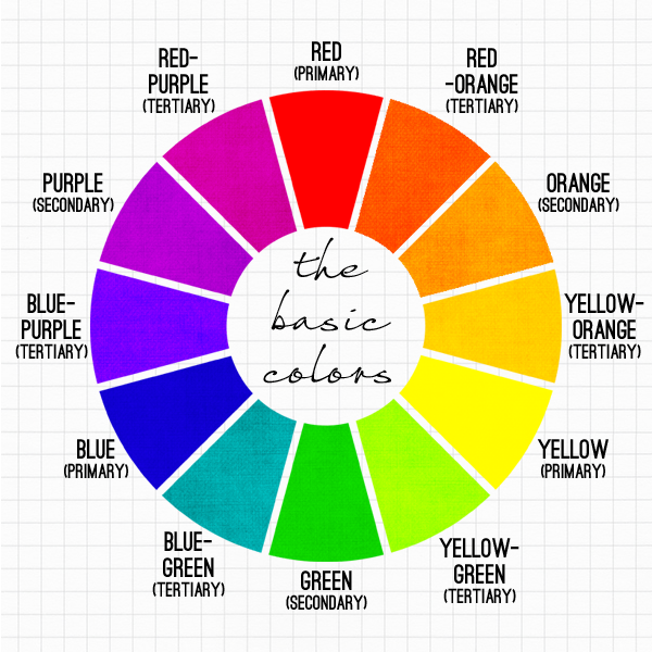
Most people would be fairly familiar with the basics of the colour wheel – but it is something that I recommend people take a moment to understand, particularly when beginning a design project.
The 12-colour Colour Wheel is divided into 3 groups of colours:

Primaries – Blue, Red, Yellow
Secondaries (when you mix 2 primaries together) – Purple/Violet, Orange, Green
Tertiaries (combination of the primary and secondary colours next to each other on the wheel) –
Yellow-orange, yellow-green, blue-green, blue-purple, red-orange, red-purple.
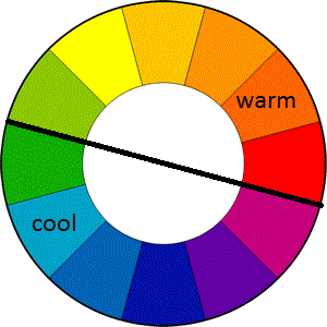
Colours are also divided into temperatures – warm and cool.
Saturation refers to the amount of grey that is present within a colour. Obviously, a colour that is very vibrant will have minimal to no grey. Pastel colours tend to have a lower saturation, meaning that they have some percentage of grey in them.
Colour Value is determined by the lightness / darkness of a colour.
Shades refers to the various values / intensities of a colour. When multiple shades of one colour are used in a design, we refer to this as a Monochromatic colour scheme.
Harmonious/Analogous colours are colours which ‘hang with their neighbours’ – meaning that they are used with colours either side of them on the colour wheel.
Complementary colours are when colours are used together from the exact opposite side of the colour wheel. These colour combinations make for the most impact. Complementary colours are said to ‘complete one another’.
There are a few things that you need to remember about colour and how you can use it:
- Colours tend to change ever so slightly in their surroundings; different sized shapes look different colours based on how much brighter or darker the space surrounding them is.

- Two shades of the same colour will emphasise their hue more when paired together rather than alone. – Dark shade will look darker and the light shade will appear to be lighter.
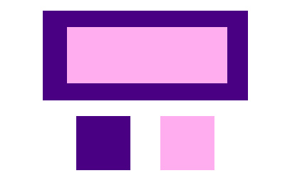
- Larger colour spaces determine the smaller areas – contrasting colours make lighter colours seem brighter.
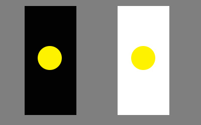
- Darker Outlines enhance enclosed colour and give it the sense of being trapped. Lighter outlines cause colours to spread and weaken.
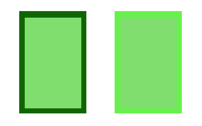
- Darker colours surrounding light make the light appear smaller.
- If using white text, make it 2-3 points larger as it is harder to read white text on a black background.
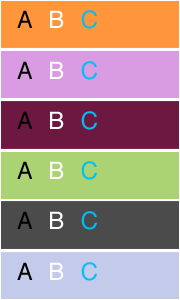 Don’t forget about READABILITY when combining text with colour. Black type on a white background is obviously the easiest to read and most commonly used. However, colour and type can be combined – you just need to be careful about which combinations you use. The contrast between type and background diminishes when their values move closer to each other on the colour wheel – this is when type becomes less legible. So try to work with Complimentary colours to gain the best results or, if using a Monochromatic colour scheme, make sure to choose shades at opposite ends of the spectrum. Avoid using Harmonious colours unless the contrast is strong enough.
Colours and the Moods they Provoke:
- Red: aggressive, stimulating, sexy, assertive, provoking, can’t be ignored
- Pink: high saturation* sensual / theatrical low saturation* gentle / romantic
- Orange: drama, friendly, appetite, warmth, vitality
- Yellow: happy, approachable, friendly, welcoming, combined with black is the most powerful combination
- Brown: rustic, durable, wholesome, rich
- Blue: Dependable, committed, calm, serenity, authority
- Green: neutral, environment
- Purple: royal, elegant, spiritual, mysterious
- White: purity, clarity, simplicity
- Black: dramatic, heavy, powerful, classic


